 ScaleVisibility
Sample websites · Financial advisors
One kind of firm, three directions.
Each concept is a complete one-page site for a fictional fee-only advisory firm: who it serves, the fee schedule on the page, how an engagement works, the team, the questions a first meeting raises, and the disclosures footer an adviser's site needs. One working tool on each. Open them on your phone.

Brindlewood Wealth Advisors
Navy, cream, and serif type. A tiered percentage fee table beside a fee estimator you can drag, a one-time plan option, four steps, three advisors, and an office in Alder Falls.
Open the classic concept →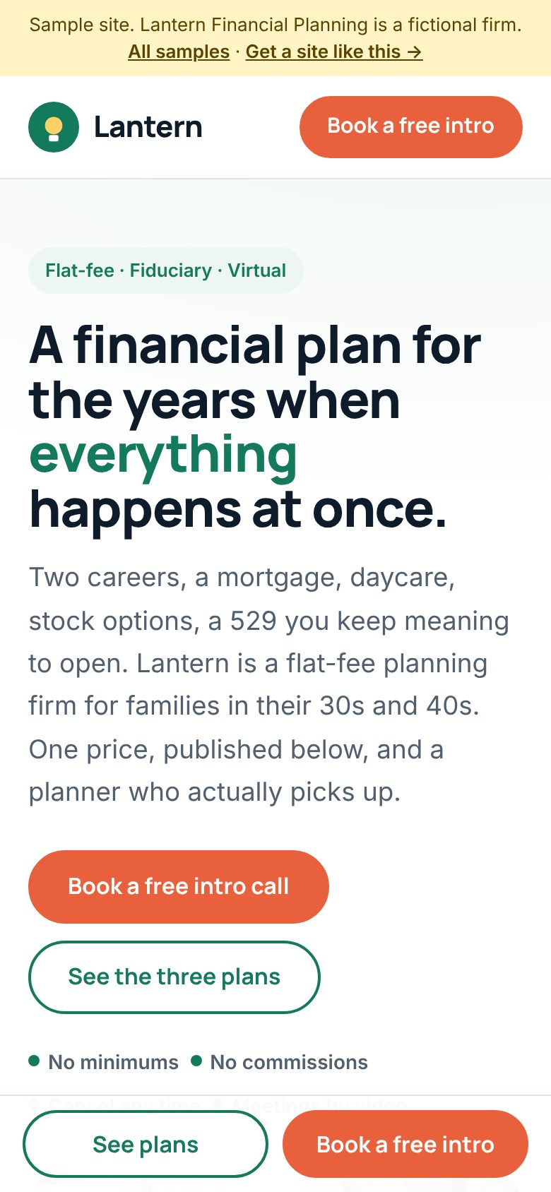
Lantern Financial Planning
Light, rounded, and plain-spoken. Three flat-fee plans with every price shown, a two-question chooser that highlights one, what a year looks like, and a booking calendar instead of a contact form.
Open the modern concept →
Granite Row Capital
Black, amber, and big type. Four situation tabs that change the first ninety days, an exit-readiness checklist that scores itself, flat annual retainers, and partners in black and white.
Open the bold concept →What every advisor concept carries
- Fees on the page, in a table a visitor can read in ten seconds
- A fiduciary, fee-only statement above the fold
- How it starts: the first call, the first meeting, what it costs
- A team section with credentials, not a stock headshot wall
- FAQ answers that match the FAQ markup Google and AI assistants read
- FinancialService structured data with the firm's facts
- Form ADV Part 2, Form CRS, and privacy links in the footer
- The registration disclosure and the no-advice notice
- No testimonials, no performance figures, no promises
- A call or booking button that stays in reach on a phone
ScaleVisibility designs and builds it at a fixed price per project, quoted in writing before work starts. Changes after launch are billed by the hour, and there is no monthly plan. Your compliance officer reviews the copy before it goes live.